Replica Restructure
I was brought on at Replica to modernize and systematize their brand foundation. At the time, the identity lacked consistency, structure, and scalable tools to support a growing company.
I started with a thorough brand audit and dove into research around tech culture, behavior, and how modern companies actually use their identities. From there, I built out a real visual system — naming conventions, asset libraries, templates, rules of application — everything you need to make a brand work, not just look good on a poster.
I ended up with a dimensional design system. Something that scales literally and visually, much like Replica itself.


But there is more to a brand than the guide.
Let’s take a look at everything that went
into the restructuring of Replica.
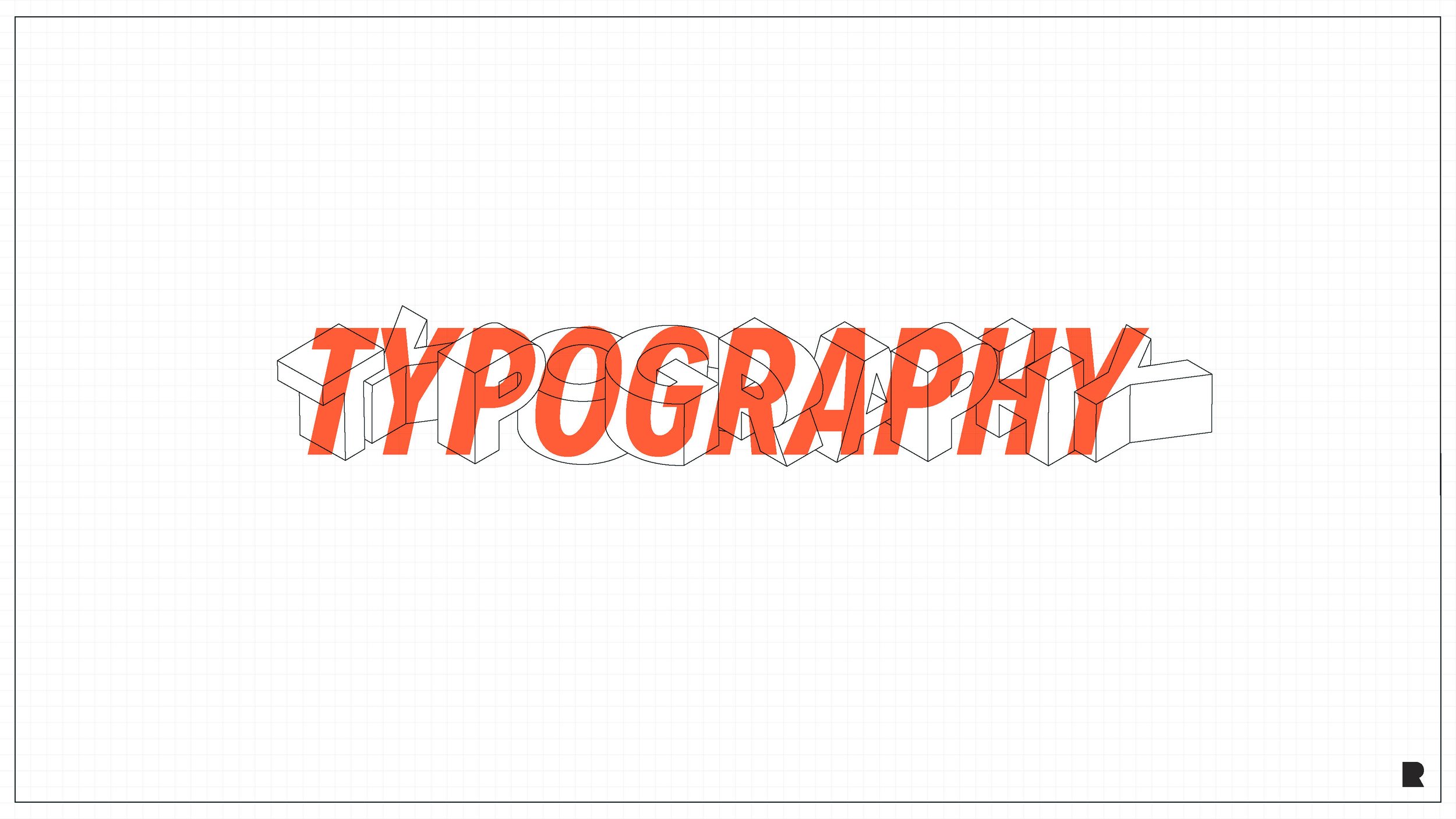
High level, quantitative document design

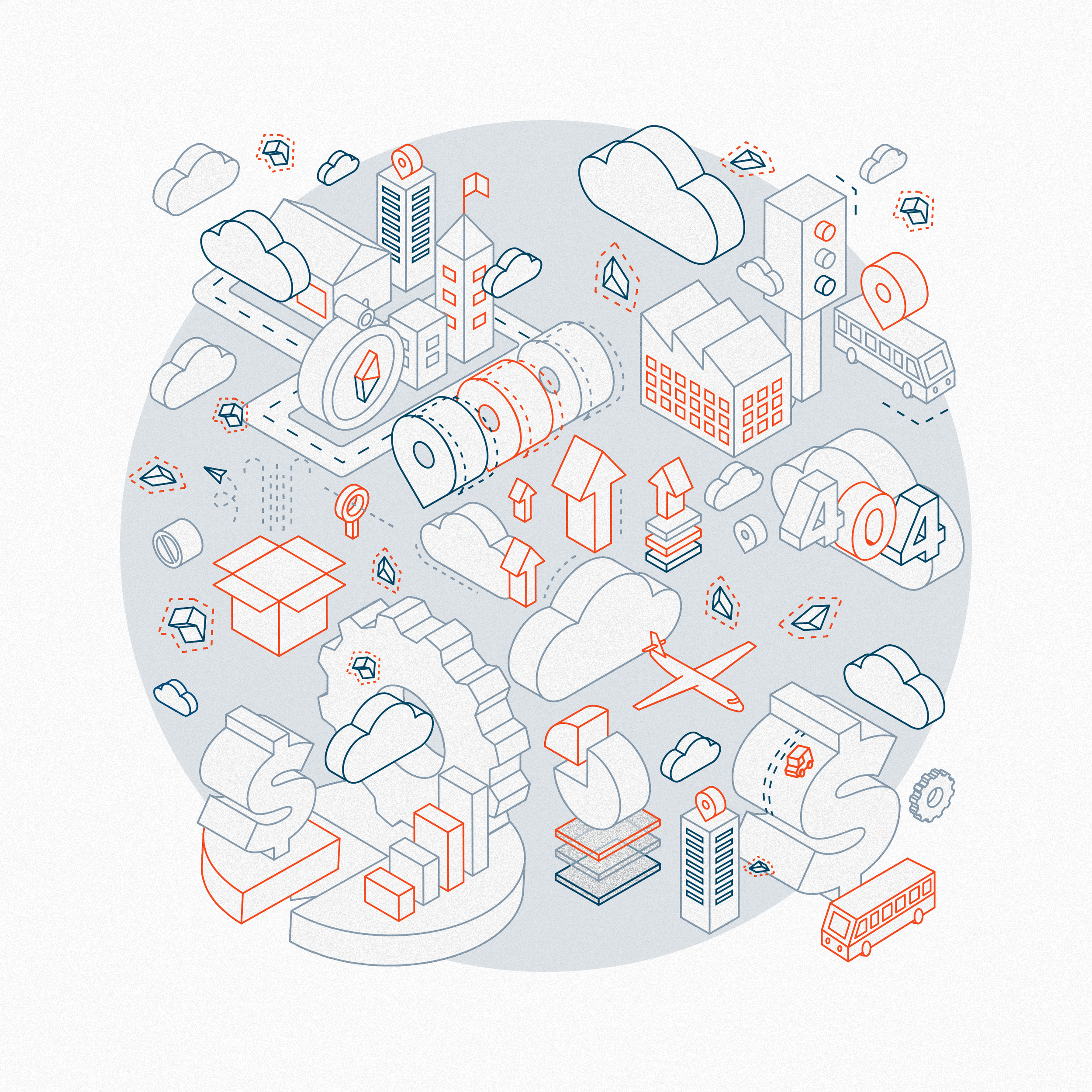
Illustration
Illustration became an opportunity to define something distinctive. I wanted to move away from stock imagery and build a language that reflected the layered, structured nature of data.
After some inspiration and further research, I developed an isometric system and refined it through grids and iteration. Over time it evolved into a technical, modular style that felt specific and intentional. It aligned with the product itself instead of relying on generic visuals.


Environmental Graphics

Acquiring a new office in Kansas City, Replica needed environmental graphics. Graphics for their conference rooms, their main office space and a company poster I made on my own time. Just as an attempt to tie the three offices together.


Motion
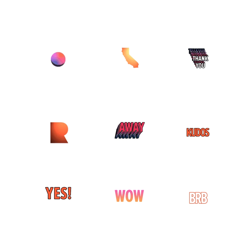
Replica lacked an explainer video that coherently explained who they are and what they do. Through storyboarding, frame design, and creatively directing the animation house (Justin McClure Creative) I was able to bring our new brand to life. I might have snuck a quick logo animation in there too…and some Slack emojis.

Business Cards
This is the card that you mock up every single time and it never gets produced. But this time around I really pushed for the bells and whistles to actually be included on these. Each card is triple layered with black foil in the middle layer. Using a laser-cut we removed the cubes and let the foil show through. Edges painted orange. and all this comes out to a 48pt weighted card.

Apparel

